How to set up modern design system using Storybook and Figma

As our product expands, and so does our team, we need to have a better workflow. By basing themselves on a single source of truth, designers and developers speak the same language, and everyone can then focus on the essential: the user experience. This source of truth is called the design system, and we will tell you how we put it in place at Escape. But first, a little explanation of what it is exactly.
What is a design system?
As Dan Mall writes in his article What is a Design system?, there are a lot of ways to define a design system, for example Alla Kholmatova, Design Systems said:
A set of connected patterns and shared practices, coherently organized to serve the purposes of a digital product.
Andrew Couldwell, Laying the Foundation wrote:
Design systems bring order and consistency to digital products. They help to protect the brand, elevate the user experience, and increase the speed and efficiency of how we design and build products.
And Marco Suarez, Design System Handbook defines it like this:
A collection of reusable components, guided by clear standards, that can be assembled together to build any number of applications.
Even though there is a wide range of design systems, in his article, Dan Mall identifies 6 of them from his own work experience. In my company, we are using the design system he describes as Tools:
Tools are some of the most common instances of digital design systems we see. UI kits are great examples.
and a bit of the design system he describes as Process:
Governance lays out who does what and when. So, process and workflow is a really big part of how design systems need to live within an organization.
Because we are using Figma for the design process and Storybook for the developers team.
How do we use it?
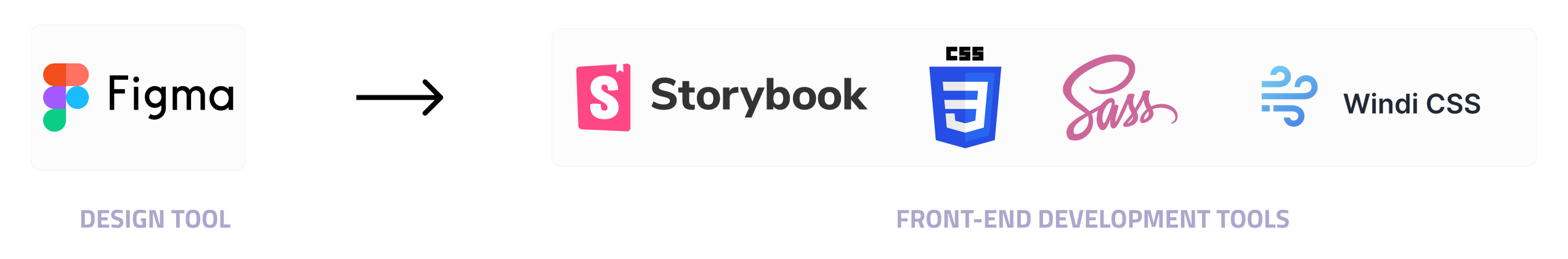
Today, we use these five tools to build our design system.
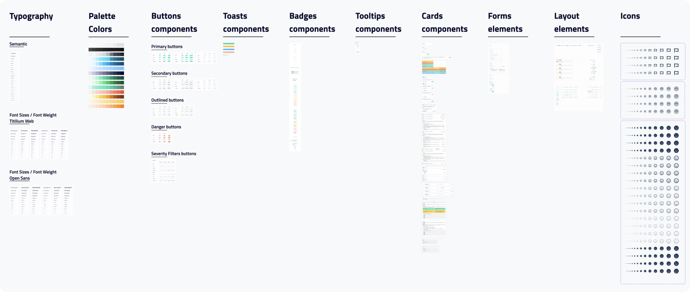
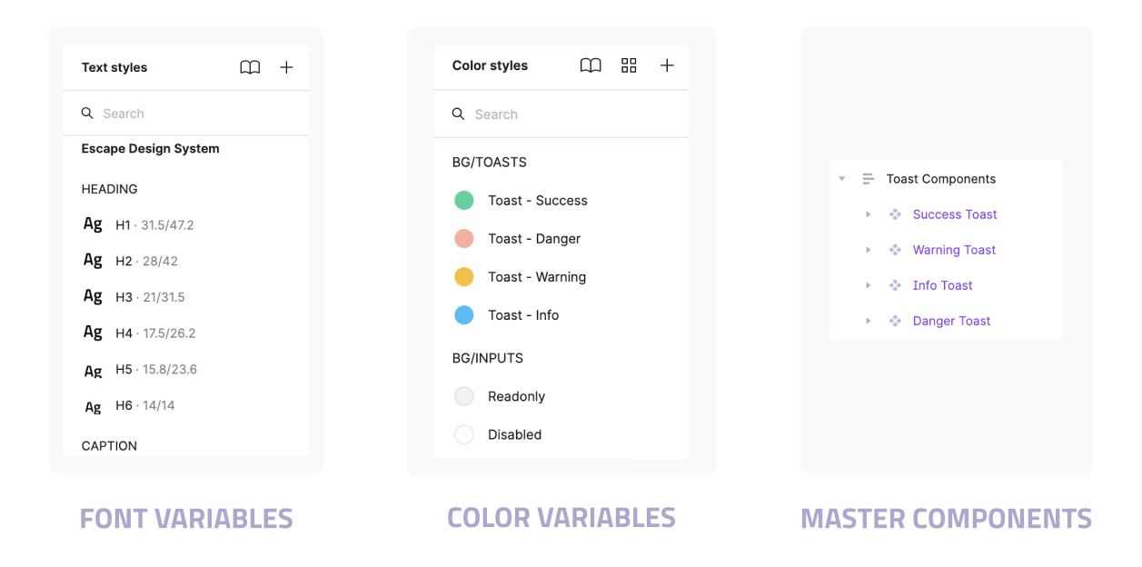
In the design process, we use Figma, the base that combines all the elements that make up our design system. Indeed, you can find our typographies, colors, spacing measures, icons, and components there.
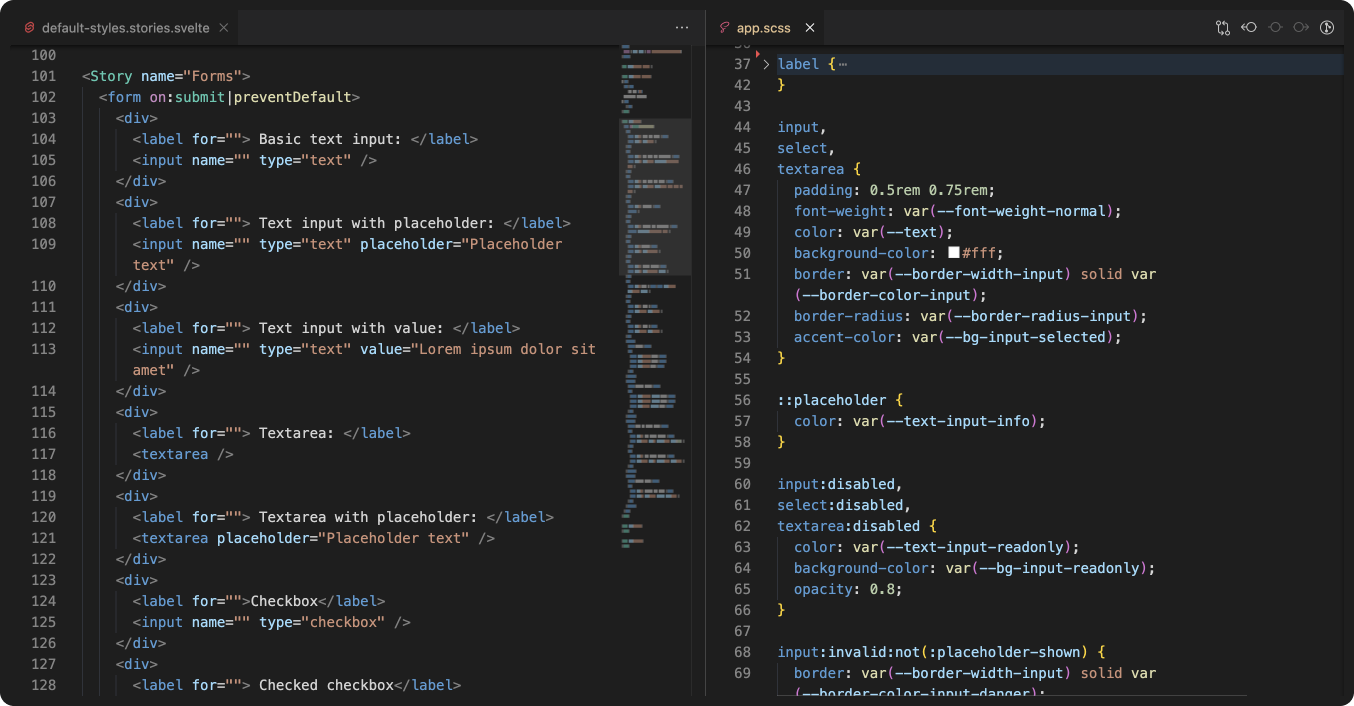
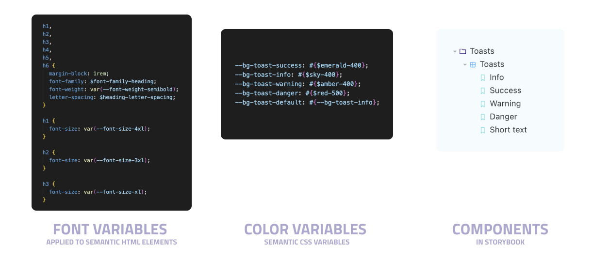
In the development process, we use Storybook as our UI library where developers can access our coded components previously designed and validated in Figma. Additionally, we use Sass to declare all our colors, fonts, and breakpoints variables as well as CSS to declare semantic variables using a naming convention. Finally, for the utilities we use Windi, which is useful for spacing and the layout.
How did we implement it?
Before implementing our design system, we partially used a UI kit named Creative Tim, but we had a lot of hardcoded values (hexadecimal colors, spacing...). So to create our own design system, we proceeded in 2 steps:
1- Design system initialization
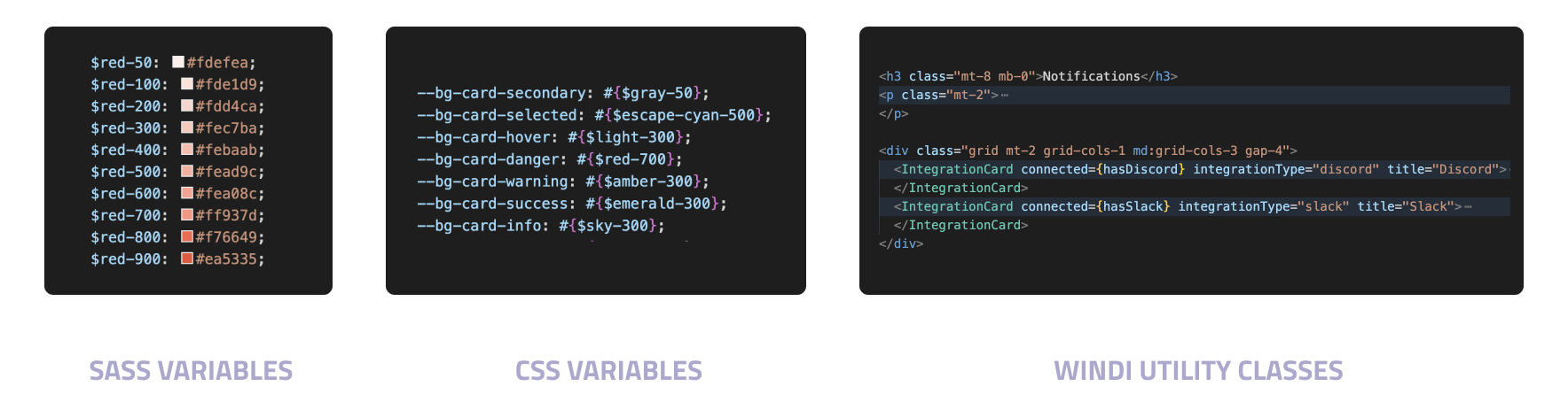
In a incremental way, we created our color palette with SASS variables in variables.scss file:
$red-50: #fdefea;
$red-100: #fde1d9;
$red-200: #fdd4ca;
...
We initialized CSS semantic variables in theme.scss file:
  --text-badge-danger: #{$red-900};
  --text-badge-success: #{$escape-cyan-600};
  --text-badge-warning: #{$amber-700};
...

  // Font Family
  --font-family-body: $font-family-body;
  --font-family-heading: $font-family-heading;

  // Font size
...
  --font-size-tiny: 0.95rem;
  --font-size-base: 1rem;
  --font-size-l: 1.125rem;
...

  // Font weight
  --font-weight-light: 300;
  --font-weight-normal: 400;
  --font-weight-medium: 500;
  --font-weight-semibold: 600;
  --font-weight-bold: 700;
Our spacing system is based on the font size root. For vertical and horizontal spacing, we set up Windi CSS:
  <div class="mx-auto my-8">
    <div class="px-4">
      <h2>We use Windi's spacing system</h2>
    </div>
  </div>
We set up Storybook to code all our designed components and to reference our default stories with their associated style in app.scss file.
2- Design system establishment
When the design system was robust enough we removed our old UI kit and replace all hardcoded values with CSS semantic values. 🧹💅
What did the design system bring us?
Today, it is much easier to maintain the product as each component existing on Figma is named the same way in Storybook and that enhances the workflow between the design and code processes because they use the same vocabulary.
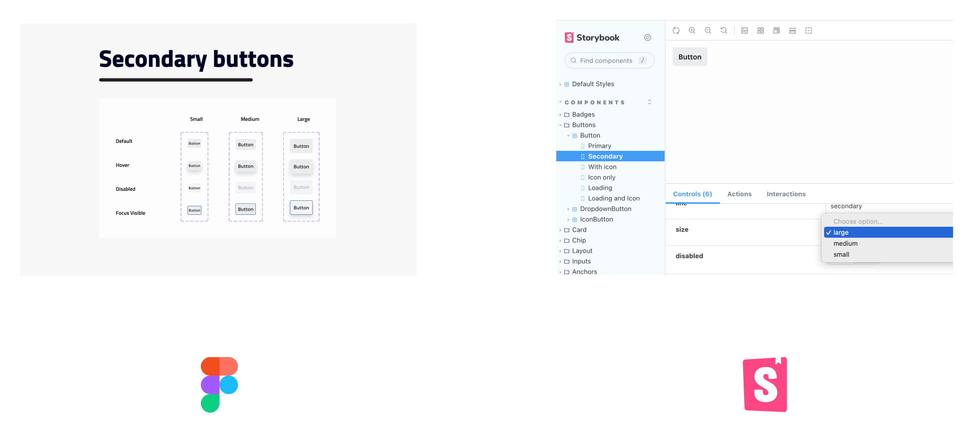
It enables the designers’ team to be more efficient. Indeed, all the colors and fonts variables are already set up in Figma so it doesn't take long to design components or pages. Besides, components are documented in Figma where they can be easily selected when designing new layouts.
The same process applies to the developers’ team. They can use existing components in Storybook that are necessary to develop the feature without thinking of the components' design or without writing a single line of css.
Needless to say that when a new component is created, it must be validated by the product team and then be coded into the Storybook so that the developers can use it in the future.
This design system works well with our process, but we will likely tend to a more integrated and fluid workflow that responds to our organization's needs. As Dan Mall writes in his article:
Design systems as products need to grow organically with the needs of the organizations they serve.
Therefore, design systems as products would fit in perfectly with our desired workflow. According to Dan Mall, this design system can be defined as:
A connected, package-managed, version-controlled software product that contains the smallest set of components and guidelines an organization needs to make digital products consistently, efficiently and happily.
To sum up, we passed from almost nothing to a Tools and process design system, but we know that a design system is not something static and will grow organically with our needs. And that's what makes it fascinating working on it.
Food for thoughts
💡 Wanna learn more about code quality? Read our blog article "GraphQL errors: the Good, the Bad and the Ugly".